 You may need to check a few previous posts to catch up with what this is about:
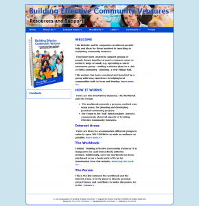
The image on the right is the home page of the site I’m reviewing. The reason it’s there is if the site owners find my comments they might change the site! I shall mainly comment on the home page for this reason! If you click on the image it will open up and click again to get to full size.
The Association of Bridge Building Churches owns the Building Effective Community Ventures website. I was marginally involved with this group a few years ago but have no ongoing involvement with it. My interest is in the site as a learning opportunity and I hope my comments will be found to be constructive.
The site has a domain authority of 11, which is not brilliant. It has a few backlinks and is recognised by Google. This site resources owners of a manual and so it is perhaps not essential it is easy to find. However, if they wish to sell the manual through the site, they may need to do more work to raise its profile.
Site Structure
Appearance
The site uses a free CSS template and a link can be found at the bottom of the page. It is a basic site and this has a lot to recommend it. The background is a single tone of blue and the central column is black text on a white background. This enhances readability and reduces distractions. The header has an attractive image although the text is perhaps not so easy to read. There is a mysterious box on the left with the word “Contacts” in it.
Navigation
The navigation is easy to follow although I do find it irritating when the top item (capitalised) in the drop down menu is the same as the item in the main menu. The visitor has to check that both target the same page. The last item in the “Interest Areas” menu is incomplete and so it is not clear what it is. If you click on it, you arrive on a page without a heading. The page is not very helpful and I found more useful information on this theme elsewhere on the site. This leads me to think the navigation perhaps needs to be checked by someone familiar with the site. The header does not include a link to the home page.
Clutter
The site is not at all cluttered. Each page seems to have one topic. In this sense the site works very well. Overall the content needs to be reviewed, as I think the site might benefit from losing a few pages.
Site Content
Market
The market seems to be people who purchase the manual, who can access to more material. The second paragraph on the home page lists the people expected to take an interest.
Purpose
Similar to many (most?) church-related sites, the first heading reads “Welcome”. It is a h2 heading and I’m not sure what has happened to the h1 heading. The word “welcome” should be banned. Why?
- It is not necessary to welcome visitors to a website. Of course they’re welcome, why otherwise have a website?
- It wastes the top heading which can contain information that helps the visitor orientate to the site. They know they’re welcome and they need a reason to stay!
- At one time search engines would use the h1 heading to identify the purpose of the site. Apparently this is less important than it used to be.
The first paragraph does not really include a benefit for the visitor. If they are setting up a project they need to be told how this site will help them!
Overall the copy on the first page could focus on how the site will help the visitor. The copy focuses on what the website offers, with links to pages. It would be better to say “If you want to know x, then try page y.”
Call to Action
The biggest weakness of this site is that it is not very clear what it wants the visitor to do. Is its main purpose to add value for owners of the manual, or to persuade visitors to purchase the manual? I would have a clear means, perhaps in a sidebar, to register or sign up for the extras.
Then I would sell the manual from the home page. As it stands if you click on the link below the heading “The Workbook” you go to a sales page which then links to an external site called Fast Print Publishing, which you have to search to find the manual. I couldn’t remember the name of the manual and so I think many visitors would give up at this point.
I don’t have the space to analyse the sales pitch for the manual except to say it could be better.
Neglect
Finally, whilst there is nothing on the site to suggest it is not up-to-date, equally there is nothing on it to suggest it is! Is this a current project or was it abandoned several years ago? There is a 2014 date in the footer, which suggests it is still current. However the comments page and blog (do they mean biogs?) are not dated. If you’re not signed up, you can’t access the Forum and so it is hard to tell if it is active.
Verdict: The site has some strengths but would benefit from a clearer purpose and some evidence of activity. Like many sites in this sector, most of the issues are to do with content and not the site’s structure.
Do you agree? Leave your comments about this site here.
