 This is my third website review, where I look at the sites of some community development related websites. If you haven’t read the others, check out these previous posts to catch up:
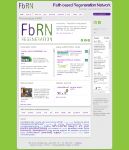
The image on the right is the site’s home page. The reason it’s there is in case the site owners change the site! I shall comment mainly on the home page for this reason! Click on the image to open it and click again for full size.
There is no information on the Faith based Regeneration Network‘s website about their platform or site designers. If FbRN designed the site internally, the issues I wrote about when I reviewed the CLES website, about relationships with designers, may not apply. One disadvantage of designing internally, is the lack of opportunity to bounce ideas off an independent online designer. This site certainly has the feel of a site developed without professional advice.
The site has a domain authority of 14, which is poor. It has no back-links and only 8 internal links. This is a little odd as there has been at least one link from my site for several weeks, so it is possible Google is slow in picking up back-links.
Site Structure
Appearance
The site is overall well designed with few distractions. The background is a solid green with the content on a pale grey background, subtle but not so dark as to make reading the site difficult. Most blocks of text are in boxes with a white background, which further enhances readability.
The first item on the page is a slider. I wrote about these abominations in my review of the CLES website. This one is just the same, cycling too quickly and drawing attention from the purpose of the site.
The logo is a little dull and perhaps given the theme of the site something more in the header would be helpful. However, it does the job as it is.
Navigation
It is largely straightforward. There is an unnecessary link to the home page, given that the logo is also a link to the home page. The “about us” link goes to the same destination as the first item in its submenu.
The menu would benefit from being a bit bigger. The purple text turns green when you hover over it. Usually the hover makes the text clearer but in this case it fades, which may be difficult for some users to read. The active link is black and for some readers perhaps not distinct enough from the purple. Some readers may have difficulty seeing what’s going on.
Clutter
The home page has nine boxes (it depends what you count) most of which contain several links and so lacks a focal point. I really don’t know what I’m supposed to do on the site. It may be OK if you know what you’re looking for but for the casual visitor there are a wealth of options.
The general advice is one message per page. Whilst it does depend upon what the site owners want from their site, I would have thought this website would seek to interest its visitors in its topic. Any new visitor will want to know what the site is about and how to start exploring it. The home page is very unhelpful in this respect.
Site Content
Market
Presumably it is people who are interested in interfaith work and social action. The tagline is “leading the way in faith-based social action”. But it isn’t clear what this means or who might be interested in it. Is the site for faith leaders, development workers, people who are interested in interfaith work or all of these? The site shows no awareness of its potential audience or interest in their reason for visiting.
If you are aware of which group you want to sign up for your mailing list, you can adapt the site to inform that group it meets their interests. There’s no need to worry about the home page being for new visitors. The old hands will return because they have a particular interest and should be able to find the information they want.
Purpose
The h1 heading and home page title is “Find out about FbRN”. So presumably this is the purpose of the home page. Some copy explaining what the site offers and guiding the new visitor to pages that might be of interest, would be helpful. Nothing on the home page offers the new visitor any help. Presumably they’re supposed to follow whatever takes their fancy.
Call to Action
To the right of the menu bar on every page there is a purple button labelled “Join our mailing list”. It took me ages to spot it. If you follow the link there is a form and no copy. I attempted to subscribe today and discovered I was already a subscriber! I vaguely recollected receiving emails and when I searched my inbox found newsletters, each containing a lot of links to detailed information. This may be helpful to some subscribers but the subscriber is offered little help to work out what to follow-up.
The home page could contain copy about the work of FbRN leading to a brief sign-up form. I don’t know what sort of response they’ve received but I suspect this would be more effective than the subscribe link on every page. A short pdf guide to faith-based regeneration might be offered to those who sign up.
A more ambitious aim might be a short course about faith-based regeneration. This might serve to introduce new visitors to the topic and could link to various resources on the site. This could be delivered via an email sequence or perhaps video or audio files.
Neglect
The last blog post is 20 February, so the site seems to update occasionally. I suspect volunteers run the site, who perhaps have no clear objectives. A scheduled series of blog posts might help keep visitors up to date with developments or introduce them to key concepts and ideas.
Verdict: As a resource for members or subscribers, assuming they can find stuff, this site may be a valuable resource. The site does not come across as campaigning or particularly supportive of inquirers. For example, how would a sixth former, writing an essay on interfaith social action relate to the site?
Tell me whether you think my verdict is a little harsh? Perhaps I’m suggesting the site should do things FbRN has never intended. I would love to see a site that took seriously education of the public about community development from a faiths perspective, sadly I don’t think this it. FbRN has a lot of information and if they could find more accessible ways to present it, they might find they become a more popular site.
 This is my fourth website review of some community development related websites. If you haven’t read the others, check out these previous posts to catch up: